Exterior Color Schemes That Hold Up Under Desert Light: Choosing a Palette That Won't Wash Out or Fade
Intense desert light flattens soft colors and fades the wrong pigments fast. Here is how to choose an exterior palette using LRV and undertones so it reads true and lasts in Arizona sun.
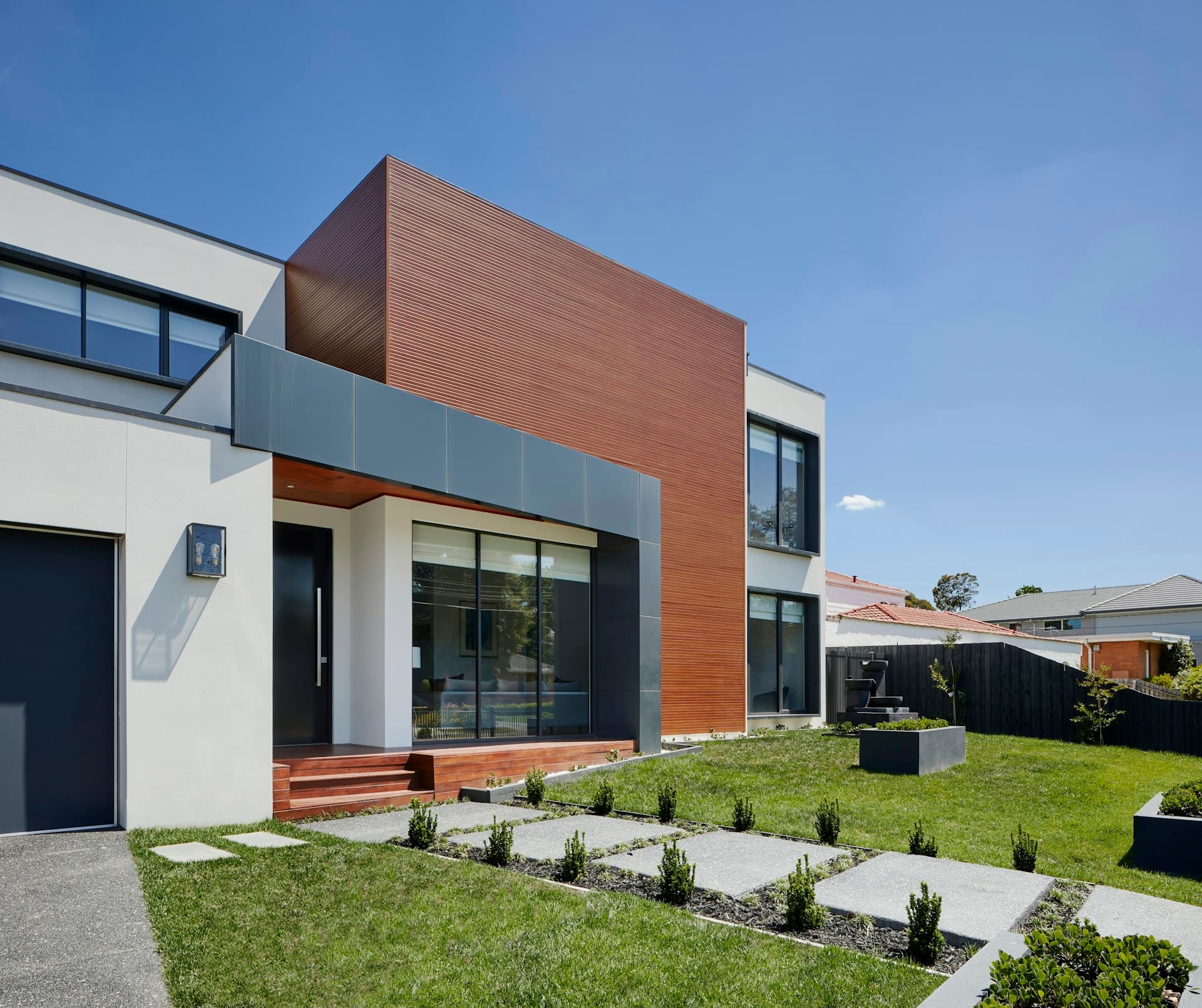
Picking an exterior color in Arizona is a different exercise than picking one anywhere with softer light. The desert sun is intense, high, and direct for most of the year, and it does two things to color that catch homeowners off guard. First, it washes out and flattens anything too pale or too gray, so the cool, sophisticated swatch that looked perfect indoors reads as a dull off-white on a sun-blasted wall. Second, it attacks certain pigments far harder than others, fading them unevenly over a few seasons. Choosing a palette that survives both requires thinking about how light interacts with the color, not just whether the chip looks nice in hand.
The most useful tool in this process is LRV, or Light Reflectance Value, a number from 0 to 100 that tells you how much light a color reflects. Pure black sits near 0, pure white near 100. Under desert light, very high-LRV colors above roughly 70 can blow out to a glaring, near-white look that hides architectural detail and shows every bit of dust and stucco texture as harsh shadow. Very low-LRV colors below about 25 absorb tremendous heat, can fade dramatically, and bake the substrate behind them. For Arizona exteriors, a body color in the mid-range — roughly 40 to 60 LRV — generally holds its character best, reading as a true mid-tone rather than washing pale or scorching dark.
Undertones are where most desert palettes go wrong, and they are invisible on a small chip. Every neutral has an undertone pulling it warm or cool, and intense overhead light exaggerates whatever is underneath. Cool grays and blue-leaning whites that look crisp in a showroom often turn flat, dingy, or faintly purple on a sunlit wall, fighting the warm tones of the surrounding desert, the soil, and the natural stone. Warm-leaning neutrals — greige with a soft beige or taupe base, warm sand, muted clay, and earthy tans — sit far more naturally in the landscape and stay rich rather than dull as the light hits them. The reliable move is to lean a half-step warmer than the chip looks indoors.
The light itself changes the color all day, which is why testing on the actual wall is non-negotiable. A swatch shifts noticeably from the flat warm light of early morning to the bleaching glare of midday to the deep golden cast of late afternoon. A color chosen under one of those conditions can disappoint under the others. The professional habit is to paint large test patches — at least two by two feet — on more than one elevation of the house, look at them at morning, noon, and evening, and check them on both the shaded and sun-facing walls. North-facing surfaces never get the same punishment as south and west walls, so a color that looks balanced in shade may glare on the hot side.
Fade resistance comes down to pigment chemistry, and this is where the paint counter conversation matters. Inorganic pigments — the earth oxides that produce tans, terracottas, ochres, browns, and many warm neutrals — are extremely UV-stable and hold their color for years in direct sun. Organic pigments, which drive many vivid reds, bright blues, and certain deep greens, are more prone to fading and chalking under relentless desert UV. This is one more reason the earthy, warm desert palette is not just an aesthetic tradition out here; those colors are literally built from the pigments that survive the climate. When a homeowner wants a bolder accent color, specifying a premium exterior line with fade-rated colorants protects that investment.
A working scheme is built in layers rather than a single color. The body color carries the mid-range LRV and the warm undertone and covers the most area. The trim is typically a few steps lighter or darker to frame windows, fascia, and corners with enough contrast to define the architecture without glaring — a soft creamy white with a warm base outperforms a stark bright white, which goes harsh and shows grime fast. Then a single accent on the front door or shutters can carry more saturation, since it is a small area that is easy to refresh and can use a fade-rated bold color. Three coordinated values in a warm family read as intentional and stay cohesive as they age.
Two practical desert realities should shape the final choice. Heat absorption rises sharply with darker colors, so a very dark body color does not just fade faster, it loads more heat into the walls — a real consideration on a home already fighting summer cooling costs. And stucco texture interacts with color: high-LRV pale colors and stark whites throw harsh shadows across every bump and trowel mark, while mid-tone warm colors soften that texture into something that reads clean from the street. The body color is doing structural and thermal work, not just decorative work.
Put together, a desert-proof exterior scheme usually looks like a warm mid-tone body in the 40 to 60 LRV range, a coordinated warm-white or soft contrasting trim, and a single fade-rated accent, all confirmed with large test patches viewed across a full day on multiple elevations. That approach gives a home a palette that reads true under the harshest midday glare, sits naturally in the landscape, resists fading where it counts, and still looks intentional five and seven years down the road rather than washed out and tired after the first couple of summers.
Need a painting estimate?
A&I Painting helps Arizona homes and businesses with interior painting, exterior painting, epoxy flooring, and cabinet refinishing.